The marketing director at Stemple had the idea to change the name, because Neue Haas...
Something wrong with the clip?
Quote
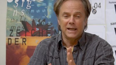
Bruno Steinert:
The marketing director at Stemple had the idea to change the name, because Neue Haas Grotesk didn't sound like very good for a typeface that was intended to be sold in the United States.
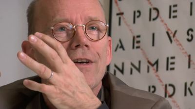
Alfred Hoffmann:
Stemple suggested the name of Helvetia, this is very important. Helvetia is the Latin name of Switzerland. My father said, that's impossible, you cannot call a typeface after a name of a country. So, he said, why don't we call it Helve-ti-ca. So, in other words, this would be "the Swiss typeface". And they agreed.
Transcript
00:00:01.000 --> 00:00:05.628
The marketing director at Stempel had the idea to give it a better name
00:00:05.963 --> 00:00:12.427
because Neue Haas Grotesk didn't sound very good for a
00:00:12.595 --> 00:00:17.348
typeface that was intended to be sold in the United States
00:00:17.349 --> 00:00:24.023
Stempel suggested the name of Helvetia
00:00:24.231 --> 00:00:29.903
This is very important Helvetia is the Latin name of Switzerland
00:00:30.613 --> 00:00:33.406
My father said That's impossible
00:00:33.407 --> 00:00:40.497
You cannot call a typeface after the name of a country
00:00:41.373 --> 00:00:46.294
So he said why don't you call it Helvetica
00:00:46.712 --> 00:00:51.003
So in other words this would be the Swiss typeface
00:00:51.001 --> 00:00:53.343
And they agreed
Clip duration: 54 seconds
Views: 105
Timestamp in movie: 00h 23m 15s
Uploaded: 23 November, 2022
Genres: documentary
Summary: A documentary about typography, graphic design, and global visual culture.
Comments