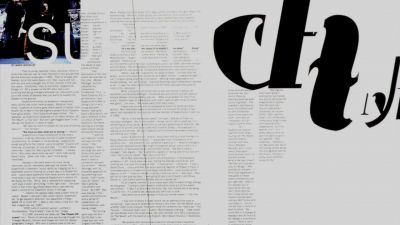
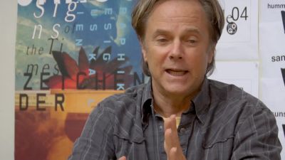
When you talk about the design of Haas Neue Grotesk or Helvetic, what it's all about is...
Something wrong with the clip?
Quote
Mike Parker:
When you talk about the design of Haas Neue Grotesk or Helvetic, what it's all about is the interrelationship of the negative shape, the figure-ground relationship, the shapes between characters and within characters, with the black, if you like, with the inked surface. And the Swiss pay more attention to the background, so that the counters and the space between characters just hold the letters. I mean you can't imagine anything moving; it is so firm. It not a letter that bent to shape; it's a letter that lives in a powerful matrix of surrounding space. It's... oh, it's brilliant when it's done well.
Transcript
00:00:01.000 --> 00:00:06.463
When you talk about the design of Haas Neue Grotesk or Helvetica
00:00:06.464 --> 00:00:14.001
what it's all about is the interrelationship of the negative shape
00:00:14.096 --> 00:00:16.473
the figure ground relationship
00:00:16.474 --> 00:00:20.143
the shapes between characters and within characters
00:00:20.144 --> 00:00:23.073
with the black if you like with the inked surface
00:00:23.981 --> 00:00:27.275
And the Swiss pay more attention to the background
00:00:27.276 --> 00:00:33.448
so that the counters and the space between characters just hold the letters
00:00:33.449 --> 00:00:36.243
l mean you can't imagine anything moving
00:00:36.244 --> 00:00:38.662
it is so firm
00:00:38.663 --> 00:00:41.581
lt's not a letter that's bent to shape
00:00:41.582 --> 00:00:48.421
it's a letter that lives in a powerful matrix of surrounding space
00:00:49.131 --> 00:00:52.676
lt's oh it's brilliant when it's done well
Clip duration: 54 seconds
Views: 118
Timestamp in movie: 00h 20m 22s
Uploaded: 23 November, 2022
Genres: documentary
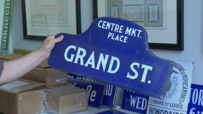
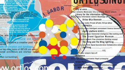
Summary: A documentary about typography, graphic design, and global visual culture.
Comments